Design Files that will make Devs fall in love with your work
DesignOps · Styleguides · Design Systems
- Type
- DesignOps article
- Audience
- Designers & developers
- Format
- Best practices guide
- Read time
- ~12 minutes
This is an article I wrote while working at Develocraft, to share with our clients' designers and show my approach to delivering designs.
Introduction
This is an article I wrote while working at Develocraft, to share with our clients’ designers and show my approach to delivering designs.
As a designer, one of the most important aspects of your job is ensuring that your design is properly implemented by the development team.
A smooth handoff process is crucial — it ensures the final product accurately reflects the design vision. Here are my best practices for design handoff and deliverables structure.
Main problems we see in design files:
Inefficient or no use of components
No styleguide, or arbitrary usage of styles
Lack of documentation — especially user flows and design decisions
Bad or inefficient responsiveness and multiplatform solutions
Scattered information and wireframes
Missing edge case coverage and missing design elements
“Always code as if the guy who ends up maintaining your code will be a violent psychopath who knows where you live.”A popular saying among coders — be aware the same psychopath may have to use your deliverables.
Taking care of the people who will use the effects of your work makes it much more refined and professional. Prepare your deliverables so they can “live” without your assistance.
The design process can take many turns — large overhauls, minor pre-launch changes. Without diligence, chaos creeps into your main information sources. It goes unnoticed while everyone shares the same “project mind” — until someone new joins, or an original creator leaves.
Treating your design files as a strong supplement to the documentation — or as the documentation itself — benefits many areas of your product.
Those areas include:
Design creation and management — with components and styles in place, consistency is fast; new ideas iterate quicker on a solid starter set.
Communication with developers — empathize with the dev and cover the information layer, and implementation goes as planned with fewer clarifying meetings. Misunderstandings extend development time — the bigger, the costlier.
Project management — files that clearly communicate flows and UI behavior support task creation and estimation, and let new people start seamlessly.
Design file
A design file that will make a happy developer.
We know teams have limited time for design and development. A solid workflow lets you create wireframes and prototypes faster — leaving space to cover the handoff part better.
By “design file” I mean an exported or online file accessed via design/handoff tools — e.g. Figma, Adobe XD or Zeplin.
Ideally, project information lives in written form as a single source of truth (Confluence, Notion), with the design file as a supplement. In reality it often goes to the extreme of having only the design file and a chat history.
What a design file should contain:
Styleguide (colors, typography, icons, grids, logos, brand graphic elements)
UI components (inputs, menus, page sections)
Wireframes & prototypes of user flows
Edge case examples and error states (e.g. a 404 page)
Animation descriptions (if complex animations are planned)
What makes it even better:
Information architecture diagram
User flow diagrams
Other artifacts:
During your work you create many other artifacts — user personas, heuristic analyses and more. They’re accessed by far more people than just developers, so store them accessibly (Notion pages, presentations, documents).
Nobody can reverse-engineer your interviews or workshops — prepare summaries that let everyone understand the findings, and keep everything bundled in one place.
Colors
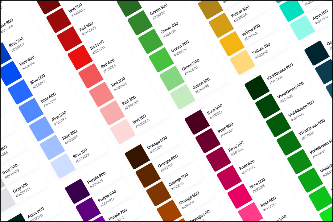
A developer should be able to enter one place, find the full color palette and build a code stylesheet. After that, no hex or rgba values should appear in code — only variable names.
Prepare it so it needs no additional explanation. Naming conventions vary — at Develocraft we find numeric tints and shades far easier to communicate: blue100 → blue300 reads clearer than mistyBlue → crayonBlue.
Our tips:
Create tints and shades for every color — treat your palette as a dependable system with no blind spots.
Combine the palette in one place, in a copyable format — attach names and values; a text layer with the whole palette saves real time.
Never use opacity for tints and shades — opacity-based colors shift across backgrounds. Overlays are fine; your main colors must look identical everywhere.
Write colors down in hex or rgba depending on the use case — design tools preview both, but writing it down saves time.
Create an accessible palette — we use a system where tone distance predicts WCAG contrast (e.g. blue100 background + gray600 text). Not perfect, but a solid foundation. “It just needs to look good” is not a contrast strategy.
Typography
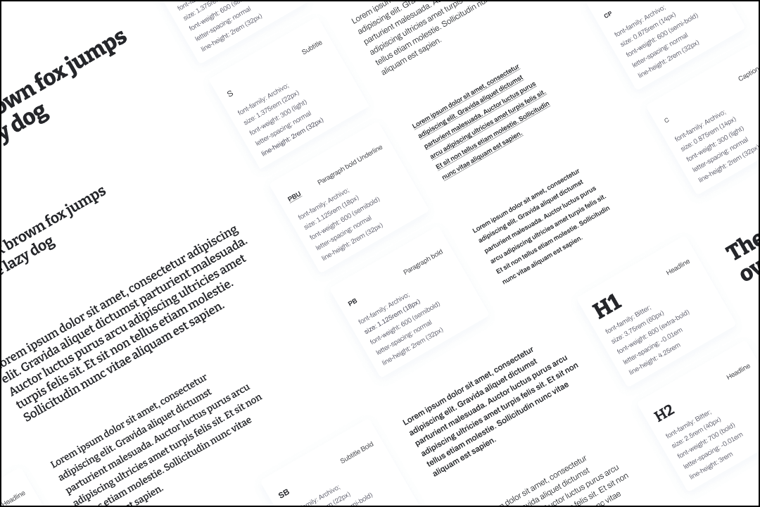
Like colors, typography shouldn’t be a bunch of text styles but a solid system — easy to apply, able to absorb change without breaking layouts.
Most developers have never used a graphic tool, and many designers don’t know the technical side of font rendering. That gap breeds miscommunication and frustration.
The designer is the first guardian of the pixel-perfect design — and the person responsible for making sure layouts don’t break.
The line-height:
Line-height defines the space text occupies. Many designers set font size and leave line-height on auto — exposing the layout to breakage.
Line-height should belong to the same system as your grid: on a 4px/8px grid, type styles must follow it too, or spacing harmony breaks (15px instead of 16px).
Adjusting line-height to the grid creates a reliable layout — even when a fallback font with different metrics kicks in. Add the value to every style description so nobody guesses.
Font-weight communication:
“Bold”, “Light” and friends don’t translate everywhere — React Native, for example, supports only “normal” and “bold”.
Use numerical values: font-weight 400 is normal; 900 reads as “Black”. Numbers make the amount of change obvious — 900 → 400 is easier to imagine than Black → Normal.
Rem vs px:
Most design tools can’t work in rems — use them anyway, the accessibility benefits are worth it.
Rem is relative to the root font size (16px by default). Users with vision disabilities who enlarge their root size get a UI that scales with them; pixel-sized UIs stay frozen.
Rems also keep spacing consistent. It’s fine to keep some small UI details in pixels — don’t sweat the small stuff.
Icons
Icons are not embellishment — they support typography, sometimes replace it. They should be part of the system and treated accordingly.
Here are the most common issues we find in our clients’ files.
Icons floating in space — no bounding boxes:
A proper icon is its shape plus a defined space — most commonly 24×24px. Bounding boxes provide consistency; most icon sets are built with them.
Without them, sizes are unpredictable and every icon needs manual placement care. Misaligned icons quietly destroy your spacing guidelines.
No icon documentation:
Using an external library? Always leave its name and where to find it.
The project may grow without you — let others keep the UI consistent by using the same set.
Raster instead of vectors:
Just no. Icons must be scalable and perfectly clear at all times — you need vectors (SVG) for that.
Additional icon tips:
Match stroke to font weight — stroke-based icons can be tuned to sit well next to bolder or thinner text. Keep whole-number strokes (1.5 rounds up).
Figma prototype color overrides — if icon colors don’t change with the component, give all layers in the icon the same name and apply a color override in the component.
Grids
Grid systems and proper RWD designs — taught at every professional UX/UI course — seem scarce in many files we receive.
Most common problems:
No general grid system (4px / 8px) — every element dances its own dance.
No or improper column grid — uneven columns lead to uneven element widths and confused developers. Use a grid calculator for widths, margins and gutters.
Grids as background shapes — use the design tool’s grid features instead of workarounds; shape-based grids interfere with real UI elements.
We also recommend creating components with similar heights — inline elements (search input, dropdown, button) with different heights break the visual harmony our minds expect.
UI library
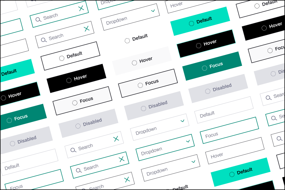
A component library that is accessible and speeds up coherent wireframe creation is a must. Build your own, or use a ready UI kit — which approach is better? It depends.
Ready kit vs own library:
Very limited development time? A library available both as a design file and a code repository (e.g. Material, Bootstrap, Tailwind) kickstarts hi-fi designs and lets devs go straight to views.
Want control? The moment you need even a tiny element the kit doesn’t support, the kit becomes useless. We generally build a small client-specific UI kit and grow it with the product — full control, and devs don’t dig through a bloated library.
The worst scenarios:
The design library doesn’t 100% match the code components (e.g. different button sizes). “Updating it yourself” soon feels like drowning in sand — and recreating your designs becomes impossible for the front-end dev.
UI kits with no code equivalent jumpstart design but burden development — with hundreds of components, nobody can tell what’s actually used. Coding the whole library is shooting a mosquito with a cannon.
Naming conventions:
Even the simplest naming system beats random poetry — a developer previewing an element should understand its state and its relation to other components.
Names in the design file should overlap with names in code. No translation layer means smoother, more comfortable work.
State coverage & scattering:
Designing a button with only default and hover states leaves the rest to invention or browser defaults. Behaviors change between devices — cover tap states too, and leave no room for guessing.
Don’t scatter. Colors on one page, typography on another, radio buttons on a third — that’s a blog with dozens of one-article categories. Keep UI elements on one page: developers instantly see the scope and can estimate the work.
User flows & edge cases
Depending on the project, your design file might be the only source of UI and flow information. Providing user paths is essential to avoid confusion.
Levels of delivering this information:
No information — just UI and wireframes. Responsibility shifts to the client/PM; we end up reverse-engineering through extensive calls. The most common form we receive — and the riskiest.
Prototype only — fast and easy with today’s tools, and shockingly often used by clients rather than designers. The most basic yet powerful form of showing flows; fine for small projects without complex logic.
Described user flows and logic — the most efficient coverage. Leaves no space for misinterpretation; usually the result of joint designer-client work. Blind spots here become development delays and cost.
Edge cases:
Many designers cover only the perfect state. If they’re lucky, a developer asks for the rest — otherwise broken layouts and unintuitive paths happen when something “weird” occurs.
When the handoff doesn’t answer (e.g. how an input behaves with very long text), the developer is forced to make design decisions for you — eroding trust and consistency.
If your tool can’t show a case, describe it (stretching inputs, character limits). Any information is better than none.
Communication

Design is not a step in the process but a cog in a machine that needs perfect alignment with the others.
Start thinking about handoff before anything exists — if possible, schedule a call with the development team and let both sides learn their needs and expectations.
Flushing everything into dev hands without contact creates a ping-pong table: the dev pushes back with comments, you push your vision. Ping, pong.
Letting others co-create a shared process creates a team — a space where everybody knows the goal and supports each other.
Let developers know how you work, from the start:
Describe your approach to UI elements and the component library — set the rule to reuse components; welcome dev feedback on inconsistencies. For some devs this is their first component library — be supportive.
Make sure they know the design/handoff tool — don’t assume; ask. Everyone should know component vs non-component, how to preview states, and where the styleguide lives. Using prototypes? Signal it clearly.
Discuss involvement and the handoff approach — describe your role and deliverables; agree who reviews the build for design consistency and how that process looks.
The final goal:
As few “oh”, “what”, “no way” and “#$@&” as possible during development — including when someone returns to your files a year later, possibly after you’ve left.
People in IT are not psychopaths (in general), but everyone can tell bad work from good. An environment where working with your deliverables is a pleasure will make you remembered.
At Develocraft we have returning clients because of our delivery on earlier projects. Your work approach and professional diligence are worth as much as your design skills.
There’s more when we meet.Drop me a hint what your needs are.
Tell me about your product, your users and the problem that keeps you up at night. I usually reply within 48 hours.
marek@makeux.pl